Letterpress and how it influences digital design
If you need a bespoke cricket ball or lacrosse stick, you're out of luck if you're looking for a UK maker. Ditto a gold beater or a mould and deckle maker. These are all 'locally extinct crafts' according to The Heritage Craft Association.
The HCA publishes an annual list of crafts at risk using a conversation score system that you may be more familiar with if you're interested in rare breeds of wildlife or nature conservation.
Also on this list, under Endangered, meaning 'Crafts classified as ‘endangered’ are those which currently have sufficient craftspeople to transmit the craft skills to the next generation, but for which there are serious concerns about their ongoing viability...' is Letterpress.
Letterpress printing is the original form of printing, as it was invented by Johannes Gutenberg in the mid-15th century. Since the 1980s it's been taken over by digital typesetting but it has survived thanks to a small number of print workshops and artisan printers.
My other half is a letterpress printer and trained as a compositor, creating type for print at Cambridge University Press before moving into film and digital (yes, it's very nerdy here). It's incredibly sad to see it dying out as there's nothing like letterpress to help any designer understand type.
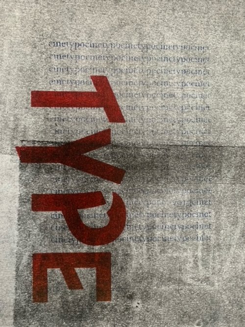
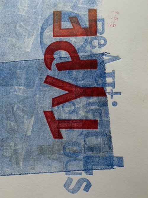
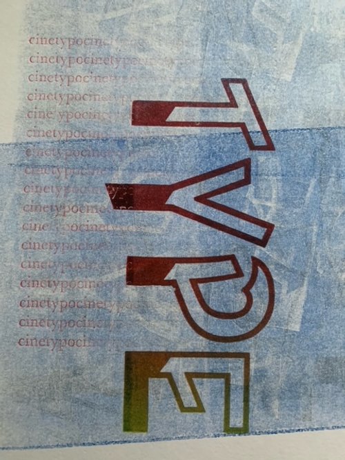
Isn't that a bit old-fashioned? You'll often hear me talk about negative space - the gaps between letters, leading, kerning, and borders. If you ever have the chance to experience letterpress printing or build type in a chase (a heavy steel frame used to hold the type in a letterpress), you'll see how ink sits on paper and how different types of paper affect the coverage. This is still relevant in digital type too as different papers can be more absorbent. File quality too. It might be old-fashioned, but it's still relevant to the art of typography and design.
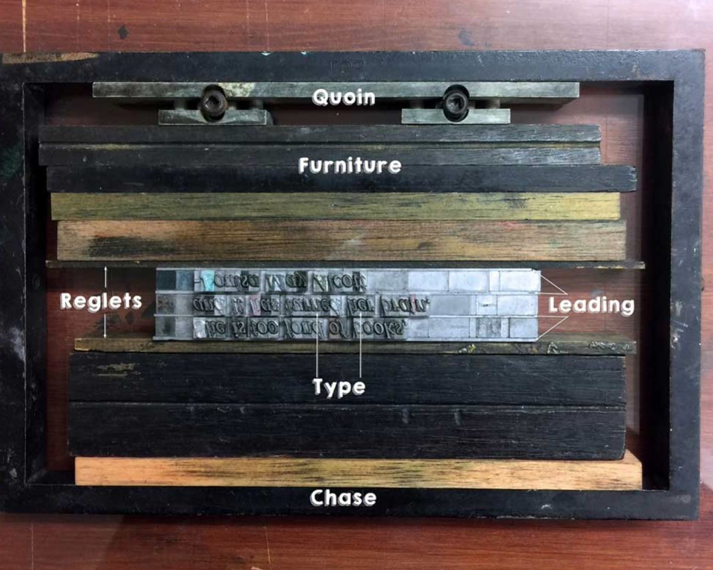
A frame set up by Inkbot Design
The subject of my Masters's Degree dissertation was John Peters who was a very talented letterpress printer at Cambridge University Press and ran The Vine Press from his home in Hilton in Cambridge. Vine Press books are highly collectible and he wrote a length on paper quality and ink coverage. You can read my dissertation here.
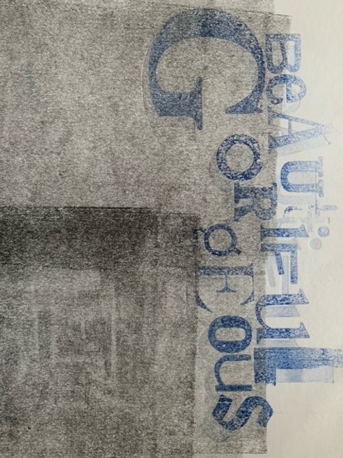
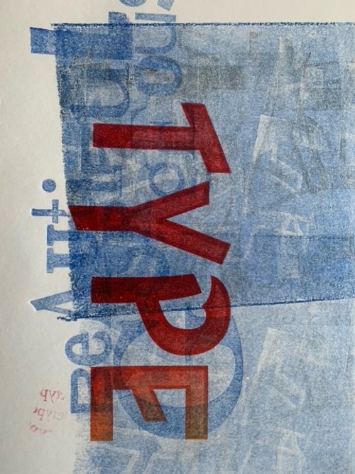
And anyway, it’s fun and messy. All designers need to get away from a screen and get inky! Here’s a print that I created, using wooden type, on Tullis Russell paper on a 1970 FAG Swiss Proof 40, known as the Volkswagen of the proofing press world! FAG still makes presses if anyone is interested in helping to keep letterpress off the extinct list! Now if only I could find a house with a workshop…!
Takeaway
Why is there no such thing as line height in Canva? Well, there is but it’s called leading. And leading was actually strips of lead inserted (as you can see from the image above from Ink Bot’s excellent website) between type. If we’re taking about at risk crafts, then we have to mention at risk language, thanks to design templates which is also a loss.