Branding and WordPress website creation
The Brief
Gateway Women is an established organisation that provides support through workshops, online events, resources and a private forum to women who are childless not by choice.
They had been struggling with their previous logo which did not provide enough flexibility to work on social media and online platforms and there wasn’t a branding guide to support it which resulted in an inconsistent visual presence.
Software: Hand drawing, Indesign, Illustrator, Photoshop, Canva. Website created in Adobe XD and WordPress Divi.
Previous logo
What Hello Lovely did
Client briefing collected and discussed. The previous logo was analysed and a personas created to develop to ensure the new design was inclusive of the global audience who maybe at different stages in coming to terms with a life unexpected, and cultural sensitive whilst paying tribute to a familiar look.
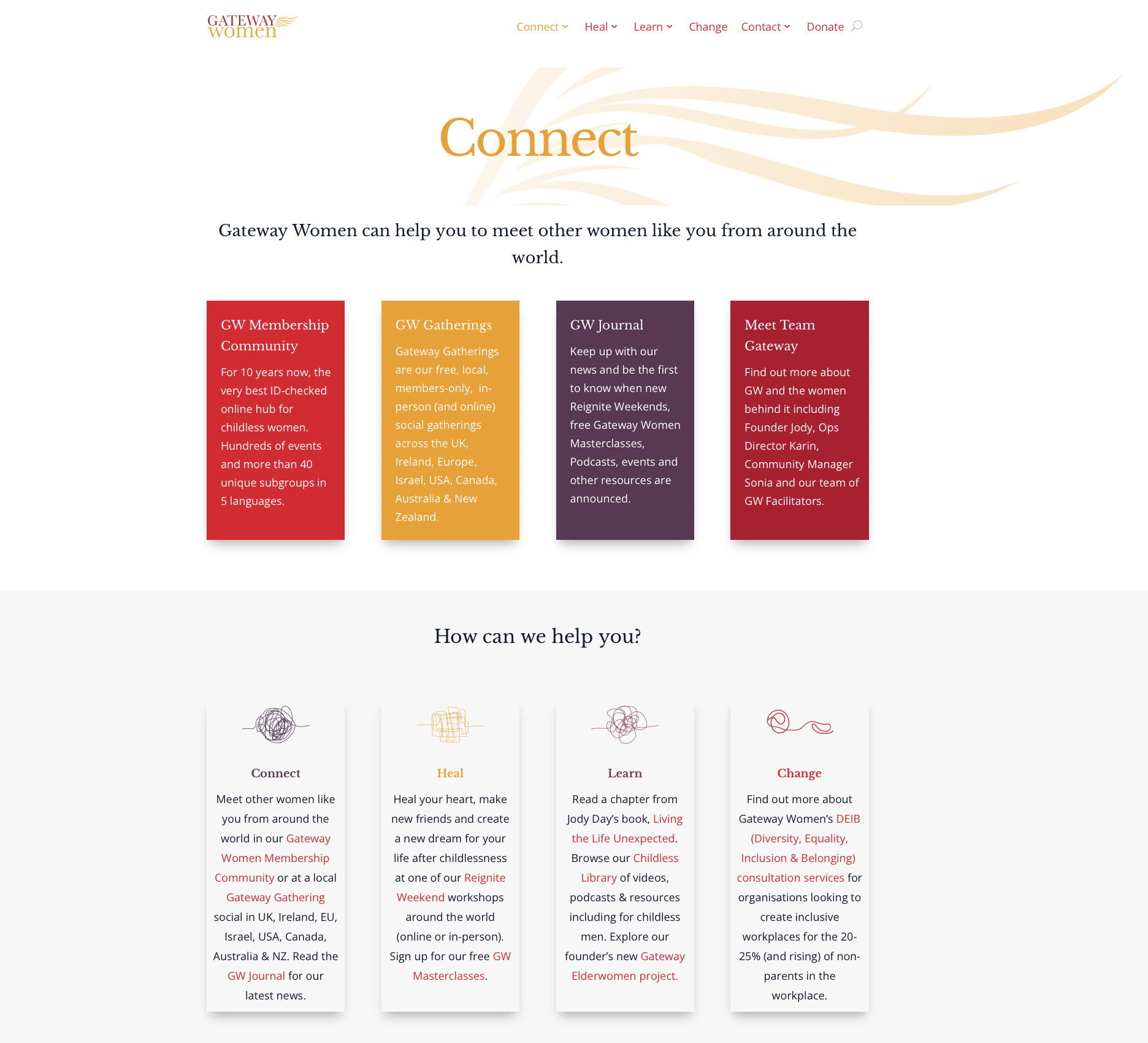
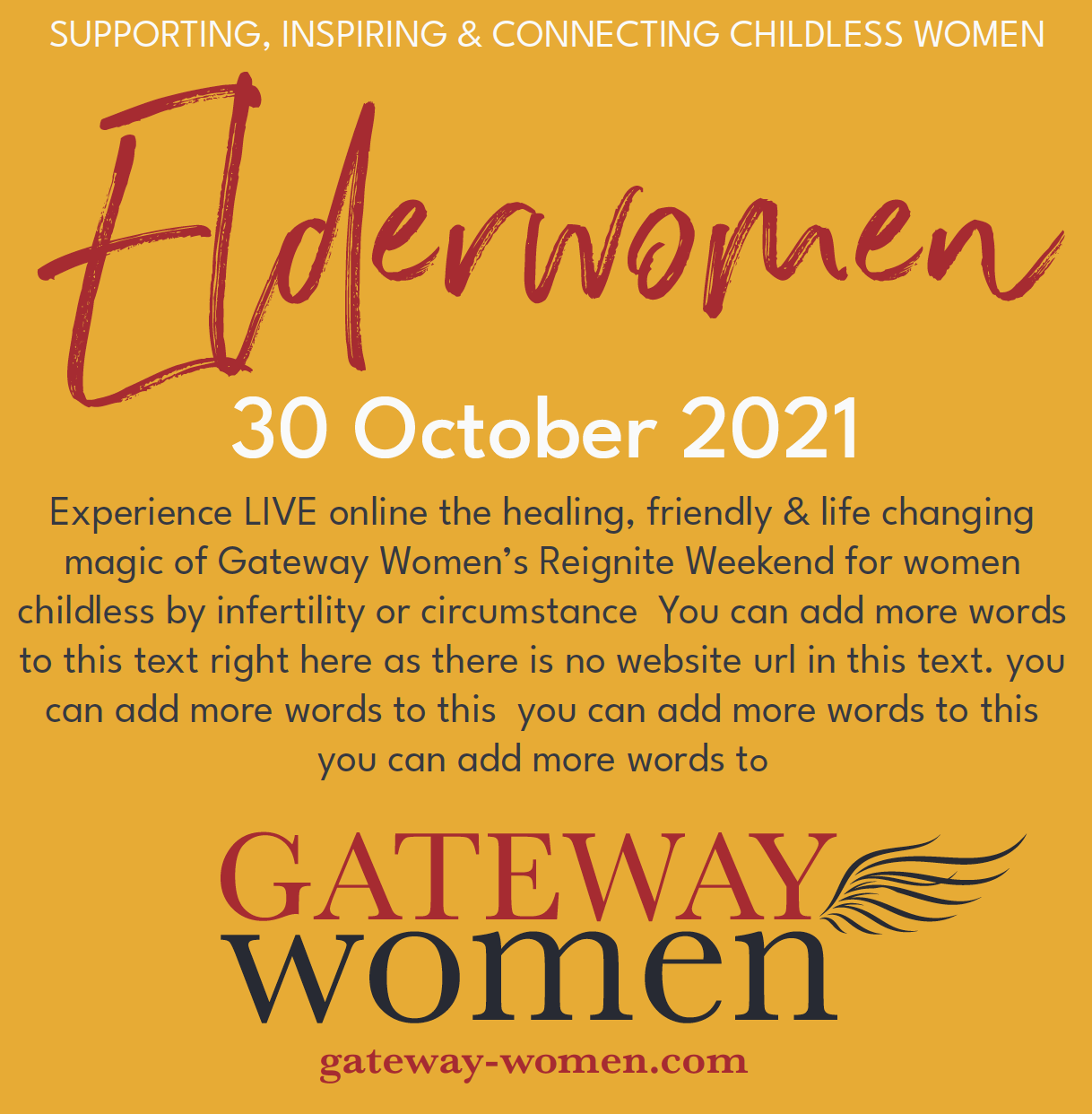
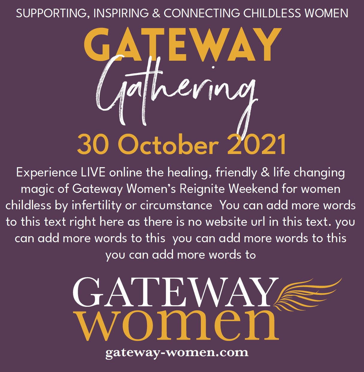
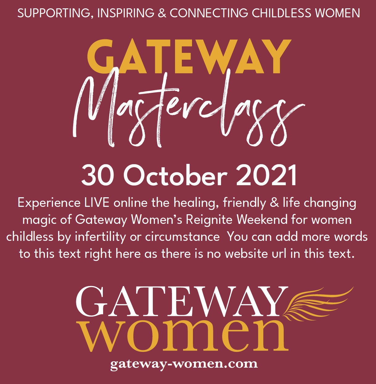
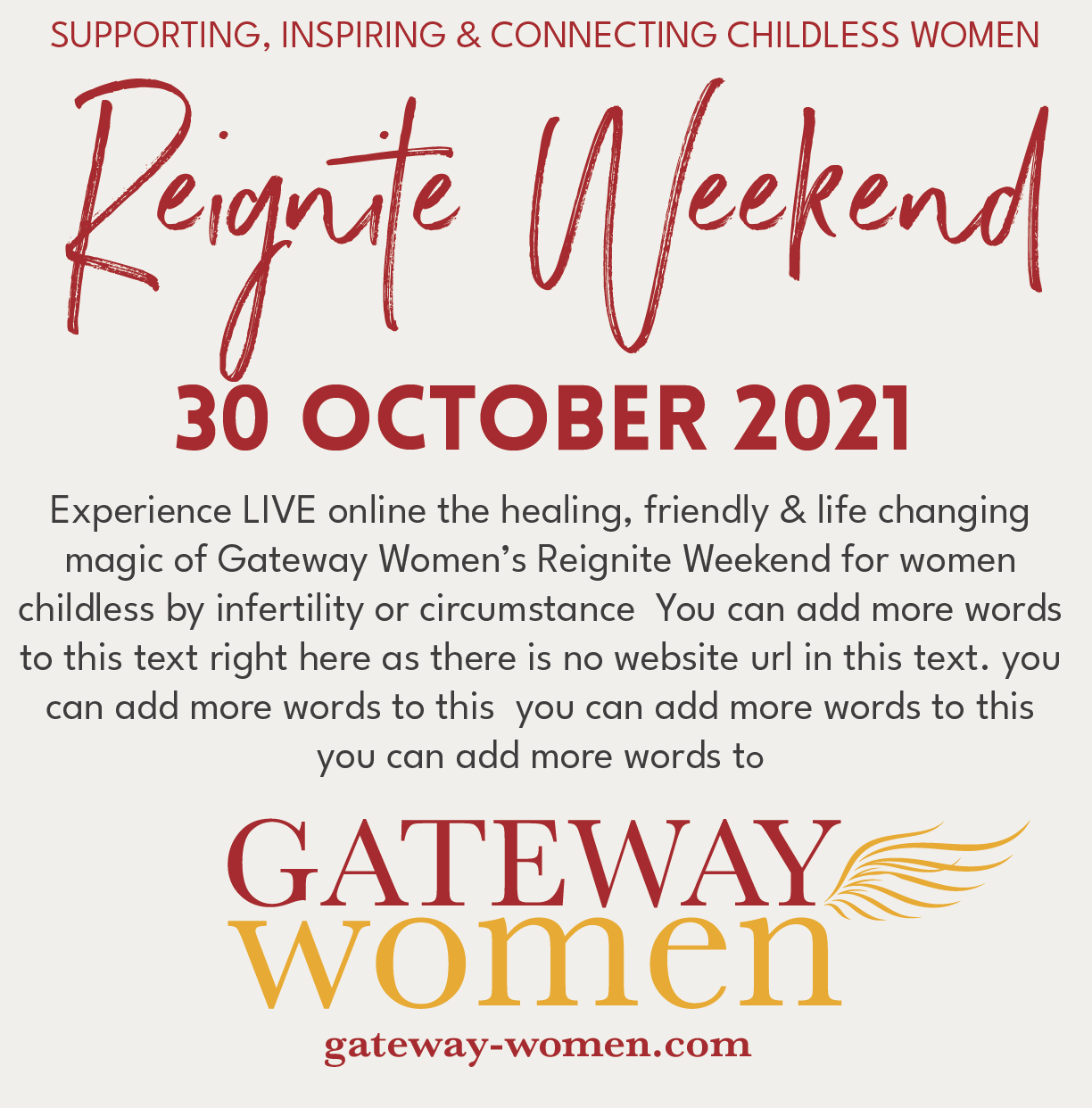
Colours were chosen based on the well liked red and gold from the previous logo - reassurance is important to this audience. These were developed so that each part of the group had a colour. The fonts were taken from the previous logo with th and the wing which is a consistent feature of the past design, was refreshed. Finally a set of branding guidelines on use along with social media templates was completed.
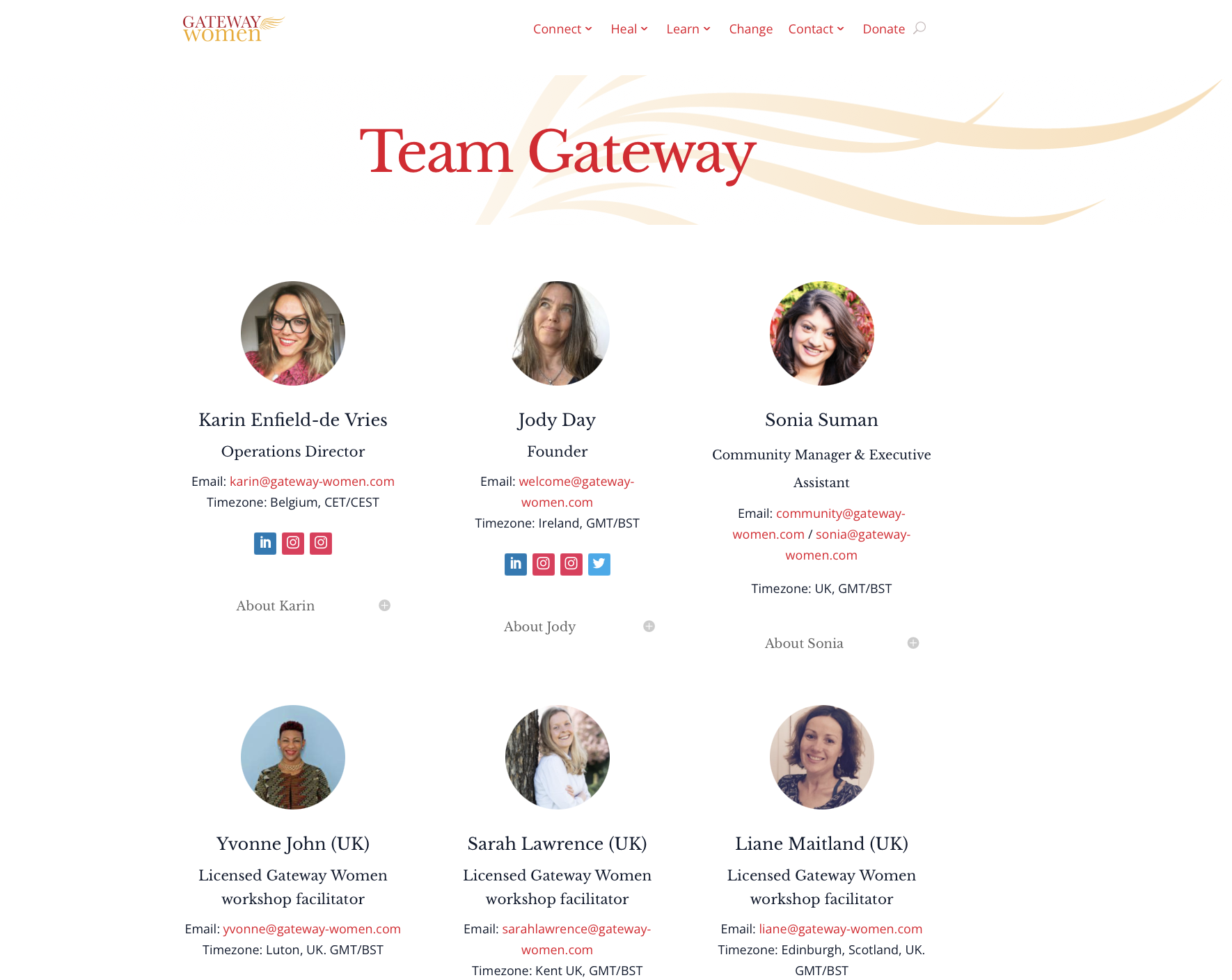
The website UX was analysed and weak points in the user experience recorded, and mapped into Adobe XD. New copy was supplied by the client. We edited this from one long form Google document into organised folders for structure. The branding was added to the design, using the colours to show the location within the website using colours and visual representation.
The Result
Gateway Women is making post-project changes to their set-up. However the creative outcome of a mammoth project that took the client on a journey too is an important one. It’s a good example of a project where the audience must take centre stage and how good design can deliver information with visual clarity.
