A-Z of book publishing: covers
How to design a book cover
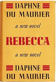
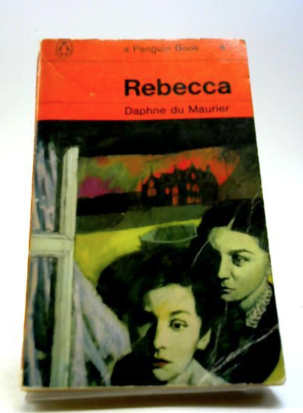
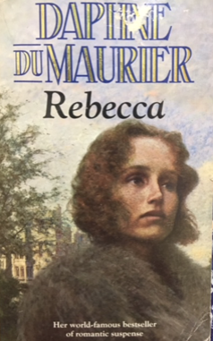
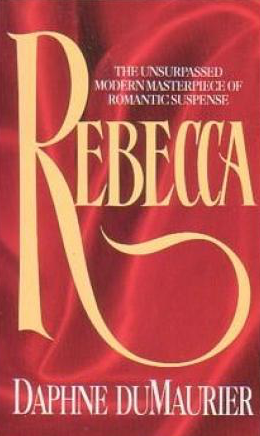
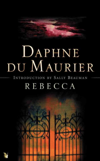
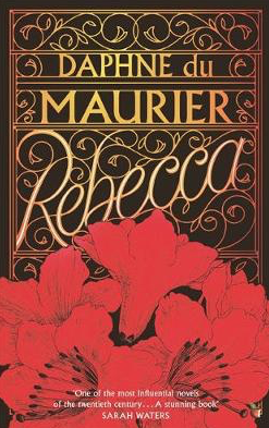
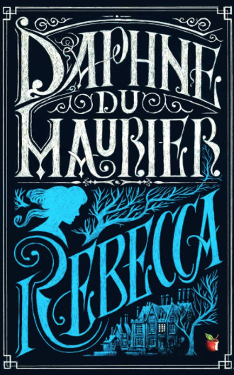
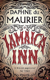
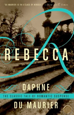
I have run cover design workshops for the MA in Publishing degree at Anglia Ruskin University. One of my favourite tasks is to use a well-established text and present all the different covers which have been published. I often use Daphne du Maurier’s Rebecca which has been published by many different imprints, the design altered to printing and design technology, cultural and taste. The text hierarchy alters as the author became popular and the marketing of the book took a different turn from gothic to romance and back again. The book, published 80 years ago, has been reprinted with different covers by many publishers over the years. In 1938, the first edition uses the author’s name twice on the cover, building on the success of her name following the publication in 1936 of Jamaica Inn. During the 1980s the book was promoted as a romance novel and it’s only recent editions by Virago where the cover has drawn on the gothic elements of the story and steering away from romantic ruins and scenes of Manderley. A recent special edition celebrating 80 years of the title in continuous print by Virago is influenced by the scene of the second Mrs de Winter finding a handkerchief. You can read more about the creation of this cover by clicking here.
Covers are very complex and I strongly urge prospective authors to allow budget to commission an experienced cover designer unless they have strong design skills themselves. A cover is so critical in catching the eye of the reader. The cover requires so many considerations beyond good design such copyright and legibility on different platforms, appropriate file formats for print and eBooks to cultural and market conditions. I have covered this in more detail on my top tips post on why a designer is more than a creative and you can read that here.
A publishing house usually creates a cover and depending on how they are established, the author may have the opportunity to evaluate the cover but rarely gets involved with the brief or the hands-on process of design. This would fall with the commissioning editor, design and art team and sales. So what is the point of this post you may wonder? In self-publishing terms, an author can and should contribute to the brief. It’s an important way to learn what makes a good cover. Here are a few top tips from me on how to create the brief.
- Research the reader. Like any project, you should have a customer persona based on your research. Who is your target reader? This will influence the design of the cover.
- Who is your competition? Aim to collect up as many covers as you can across the market. It is tempting to focus on covers from the big publishing houses but self-publishing authors are also your competitors so include their work as well. What works and what doesn't work.
- Read design blogs and publishers websites to understand a little of what makes a good cover design.
- It is tempting to save money and go for a photo from free or low cost image site. The problem with these images is that they are very popular. Whilst ideal for blog posts, the last thing you want is to see a competitor using the same photo on their cover. Buying from one of the many image libraries listed with BAPLA will give you a degree of exclusivity and much more selection.
- Beware of past trends. Women facing away from the reader were very popular a few years ago.
- Beware of being too original. Leading publishers and named authors can take risks to a point but if you’re breaking into the market it’s best to stay close to the genre.
- I often create and commission illustrators, drawing on my contacts at agencies and the hugely successful MA in Children’s Book Illustration course at the Cambridge School of Art. Artwork can be themed to the book such as these Chaucer covers for Cambridge University Press which were created with patterns in Adobe Illustrator.
- Typography is a good way to lower costs. Many book covers are created with type or calligraphy. Make sure your designer understand type - not all do!
- Get the cover underway early as it’s useful for cover reveals, social media content and marketing collateral.
- Beware of feedback. Be selective with who you seek comments from. It’s very tempting to ask your friends and family but you should always stay true to the target market.
This sounds like an exhaustive list of considerations. The great news is that with over twenty years in publishing and book cover design, I can manage this for you. I absolutely love book cover design work and have worked on all genres from fiction to education and reference, handling copyright, image research and commissioning or creating beautiful illustrations and typography based covers. I have learned first-hand about the pitfalls and limitation as well as the possibilities. To find out more and chat about your requirements do get in touch for a free, no obligation chat.
